Kulcha Travel and Dining App,
Sydney
Research
UX Design
UX Writing
Prototyping
Testing
Kulcha is a digital platform designed to help users discover, recommend, and explore dining experiences within their networks and beyond. With a clear emphasis on enhancing user decision-making, the project centred on creating a structured, accessible and engaging interface.
I led the redesign of the platform’s core experience, introducing a more comprehensive approach to presenting restaurant information. From enriched overview pages to thoughtfully integrated user-generated content, the visual system was shaped to feel informative yet approachable. Elements such as refined search functionality, intuitive navigation patterns, and clearer interaction points were introduced to help users move seamlessly between discovery and action.
It was a pleasure to shape an experience that not only empowers users to make informed choices, but also deepens their connection to their communities through shared recommendations.
The following features and updates to the Kulcha app were designed to refine the user experience, improve usability, and encourage organic growth through more meaningful interactions and seamless discovery.

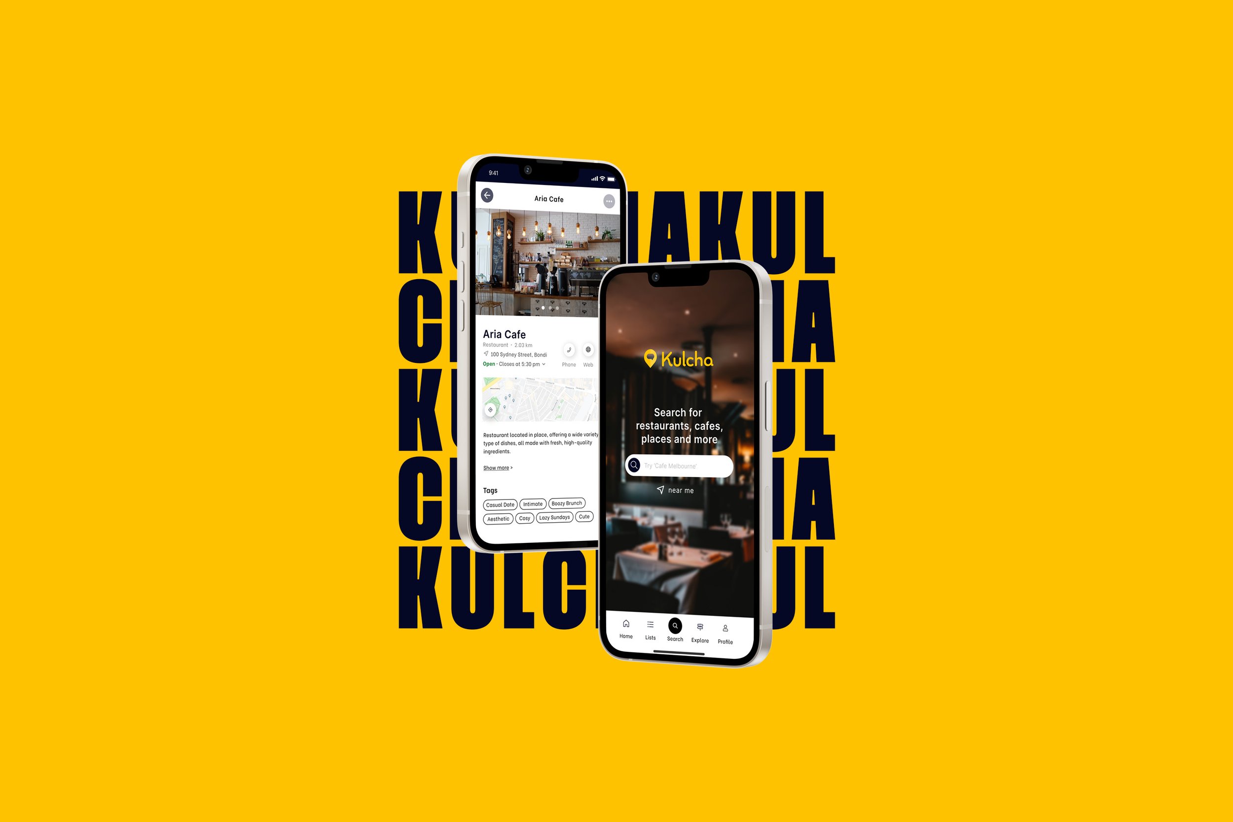
Simplified search feature.
Recognised the need to improve the search screen's user experience by streamlining the design and incorporating updated UX writing and prompts.

Clearer results display.
Updated the way information is presented in search results. By optimising the layout and content display, users can quickly access relevant details about each restaurant.

More detailed location overviews.
Building on research insights implemented a comprehensive restaurant overview screen, providing users with in-depth information about each restaurant.

Initial Changes to Restaurant Overview Screen
Improved content hierarchy and information architecture on the restaurant overview page.
Placing restaurant short-form information at the top of the screen provides users with quick access to essential details, saving time and effort in decision-making. Users can assess key information without excessive scrolling, aligning with their behavior of seeking fundamental details first.
Introduction of tags

The inclusion of tags on the page allows users to specify the vibe and characteristics of each place, empowering them to share personalised insights and experiences. This feature not only enhances engagement and interactivity within the app but also enables potential visitors to quickly identify places that align with their preferences and interests.
Addition of user uploaded content

Incorporating user-uploaded images in three categories - food, atmosphere, and "what to order" - enables users to make informed decisions about visiting a restaurant. By leveraging user-generated content, the app gains authenticity and fosters a sense of community, where users contribute to and benefit from shared knowledge.
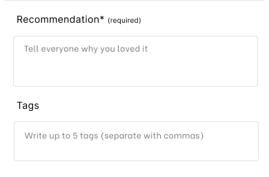
Short-form user written recommendations
To complement the user-uploaded images, short-form written recommendations were implemented. These concise yet impactful reviews offer additional insights and perspectives on the restaurant experience.


Improved the flow of the user content upload
The recommendation process allows users to provide comprehensive recommendations by uploading images, adding tags, and writing short reviews. The intuitive interface ensures a smooth user experience.


Feedback animations and micro-interactions
Added short feedback animations and micro-interactions to clarify task completion and reduce user confusion based on testing insights.

Streamlined UX writing conventions
Focused on simplifying the language as well as adopting conventions from familiar apps. By using clear and consistent terminology for common tasks as well as prompts, eliminated confusion and ensured users understood their actions clearly throughout the app.


Additional data on results screen
Revamped the display of search results to enable users to efficiently evaluate and make decisions about the restaurants they might want to visit, streamlining their initial exploration process.


Final Updates to Restaurant Overview After Testing
The restaurant overview page presents vital information, user-uploaded images, tags, and reviews, all contributing to an improved decision-making process.
Comprehensive location information
Users are provided with concise details, a map, and an expandable location description, all sourced from Google Maps’ API to ensure accuracy and support informed exploration.
Improved button positions
Refined button layout to improve usability, making the save button more prominent and adding a share option, while rearranging call and website buttons for a smoother user flow.
Scrollable user uploaded content
Introduced a side-scrollable interface for quick access to key image categories—food, atmosphere, and “what to order”—all of which can be easily expanded.
Tabbed written recommendations
Users can easily access personal recommendations from their friends and, with the option to toggle tabs, explore feedback from individuals beyond their immediate social circle.
Sticky recommend button
Addressing the client's priority to increase recommendations, we introduced a sticky recommend button fixed at the bottom of the screen. This persistent button makes it effortless for users to provide recommendations while browsing.
Changes to the Home Screen
Updated search screen with UX writing
The inclusion of a prompt in the search bar on the search page provided users with clear guidance on how to conduct their searches.
Updated navigation
The navigation bar was redesigned, with the search function now in the centre. The original home screen now serves as a news feed, and a button for accessing and reviewing saved lists was added to the navigation bar.